

For my practical work, I began to think about already existing primary dinner party condiments such as long tables, food cloche plates, flute champagne glasses, candles and cakes and started to experiment with these objects. I incorporated these designs with the 10th year celebration of The Hepworth Gallery.
Throughout this entire process, i recorded down every decision made so i felt organised and could look back at designs and concepts, just in case i decide to merge some designs together for my final creation.
My drawings were used to record and track my progress and concepts so that if i was able to place two possibly useful ideas together, to make an initial concept. The reason for my analysis beside some drawings were there for a reminder of what i was thinking at the time, in case i forgot for whatever reason. I also experimented with different logos for my poster concept, as you can see on the second image, again incorporating the main focus of this project- Hepworth’s 10th anniversary.


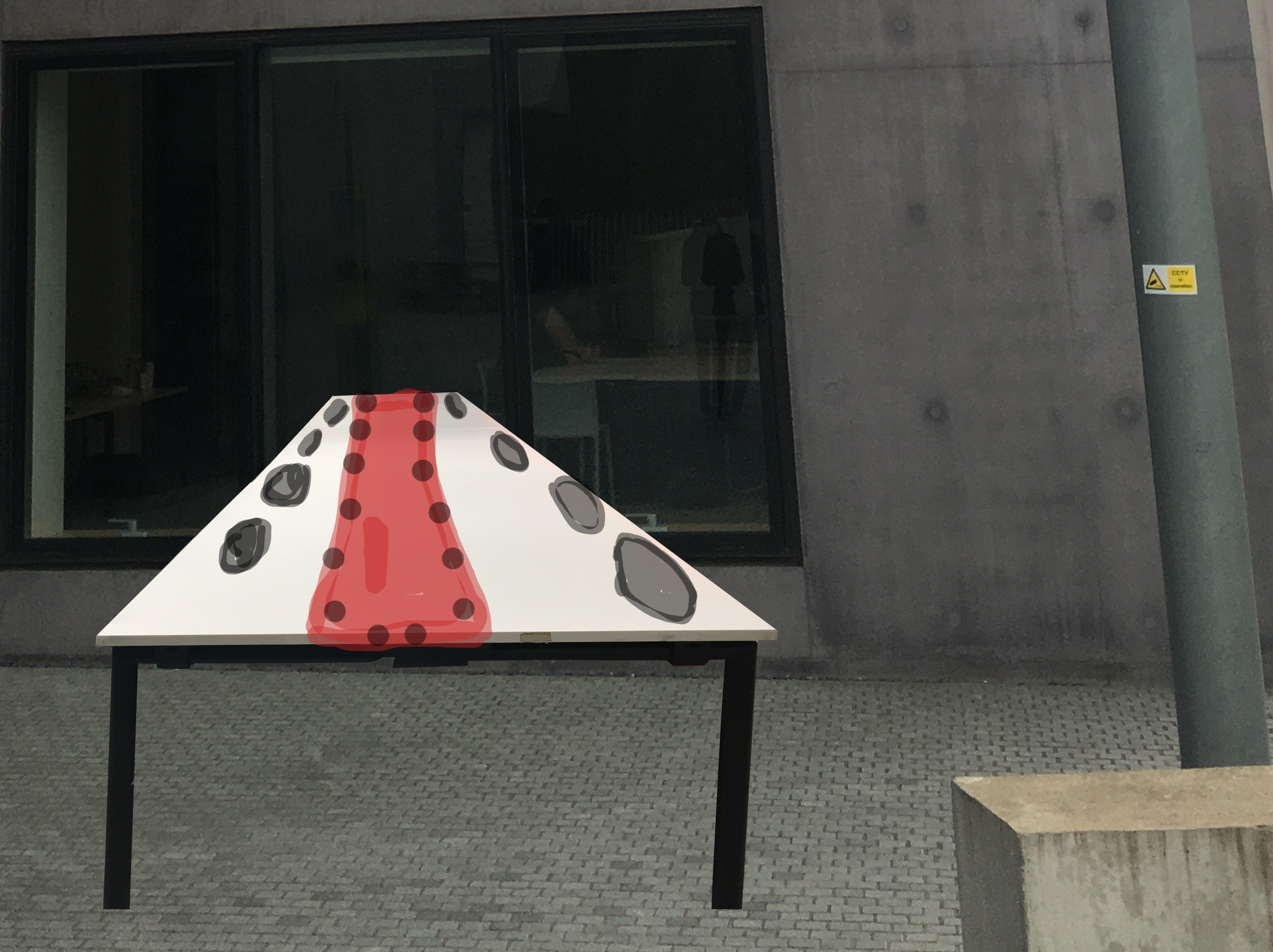
Here i began by using my initial idea of having a long professional looking table as the prioritised object of the celebration (dinner table) to include onto my posters. However as you can see this concept wasn’t accessible due to my photography not flowing well with my idea of the table appearing from inside of the Gallery, to the outside to represent a large dinner celebration. I experimented and played around with the shape of the table and where to locate it, however, after many stressful hours of alteration, the first image was as best as i could get it to look and unfortunately it still wasn’t how i wanted it. I tried to add quick sketches of imaginary plates and a table cloth to give myself a rough idea of what it would look like, and i wasn’t particularly fond of it.

I then combined the knowledge of Hepworth being a Gallery of art into this concept by quickly sketching out ‘HAPPY 10TH ANNIVERSARY’ in the shape and movement of a paint brush being used across the poster. I even tried altering the writing to give it a similar effect to my previous idea of the table coming out of the window- so the writing looked as though it was coming closer, as more of the paint flows. Considering all this, i felt as though this concept was too easy and simple for my ability, so i decided to keep it as a form of progression rather than elaborating it.


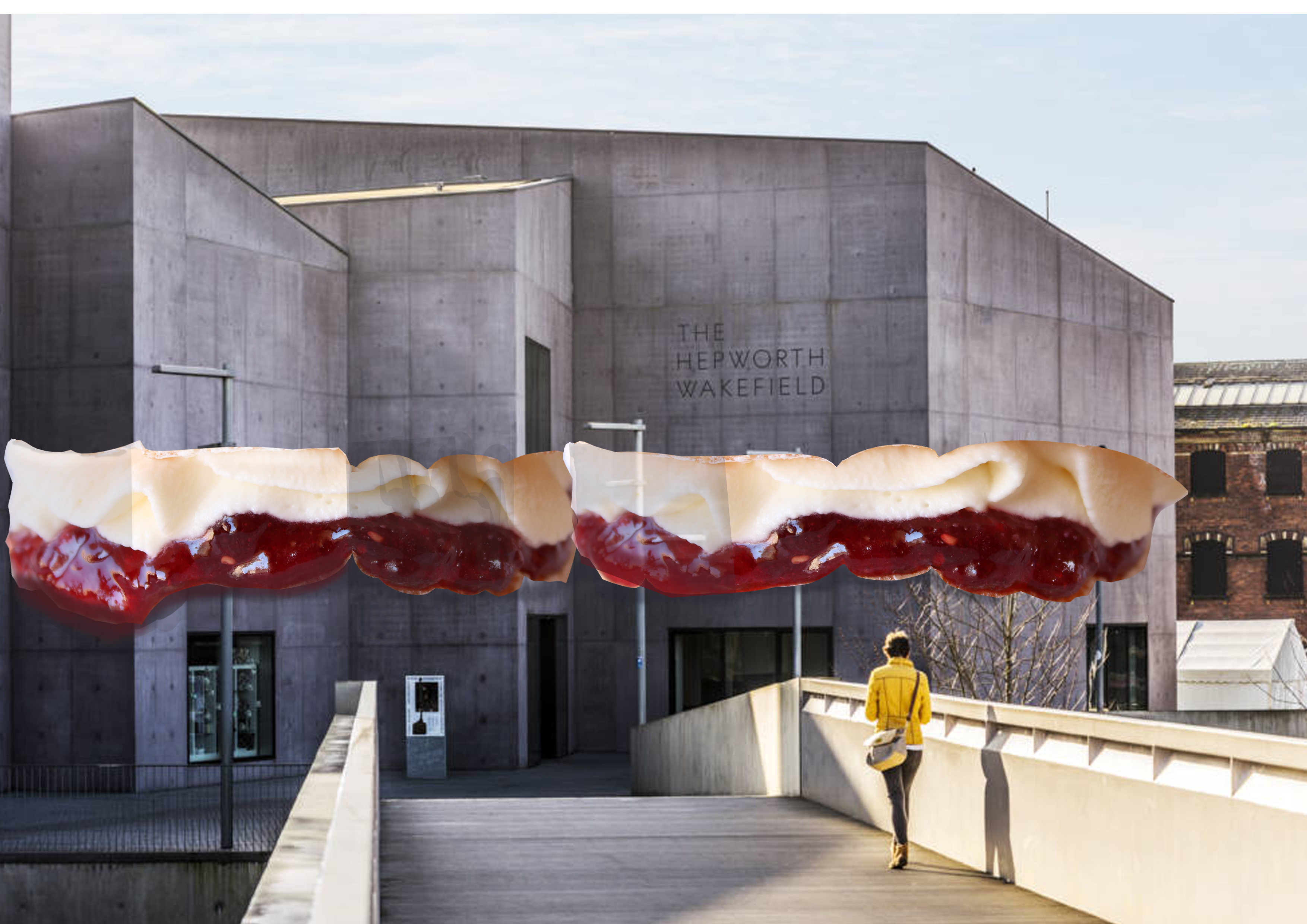
Because of my previous designs being a disappointment to me, i decided to look back at my initial drawings i made for some sense of influence and i remembered i used photographs i had taken my self, and took the idea of having a dinner party and projected that onto the sketch by using the Hepworth building as a piece of cake. I knew that the only way of it looking like one, would be to form the inside of what the cake would look like. I took this piece of information and came to the decision of giving the illusion of a slice of cake being taken away from the building. My first attempt is shown in the top right corner, however, i didn’t appreciate the pattern of cake i had chosen so i decided to look at Victoria sponge cakes instead. This lead me to the bottom right image of a different photograph, placing the jam and cream in between the building- using tools on Photoshop to bend the food around the corners of the building to make the overall effect look realistic.
I then decided to attempt my first concept of cutting a slice out of the building again, but using a red velvet cake instead. This is because the deep red colour of the type of cake compliments the grey colour of the Hepworth building more, in comparison to other styled cakes. The larger image portrayed is my outcome of this entire concept. I did like this design, however i didn’t think of it as my final piece because i craved further experimentation and wanted to ensure i was making the correct decision.


Further experimentation for my poster design was made by incorporation my previous creation of Hepworth being a cut out red velvet cake, but instead of including the rest of the realistic photography, i played around with the solid colours. I changed the level of the water and brought it higher up and placed the water buoy line above the water, just covering the edges of the Hepworth building above. The bottom left corner was my first creation and i didn’t like the knives and forks being all across the water, so i changed this concept and placed them at the bottom, on the boarder line. This change was made as i felt this looked far more professional for a poster design. The reason for me adding the knives and forks in the first place is because my main giveaway for this celebration was a free for all dinner party, giving the audience an idea of what they’re in for. I then experimented with colours, seeing which compliment the imagery of the Hepworth building the most. This lead to my final design…

I am very pleased with this final design, because although i didn’t particularly enjoy this project, i loved the outcome. I didn’t think i was capable of creating a professional yet fun looking posted, especially due to this being my first ever attempt at poster design. I feel as though these colours contrast really well with the orange buoys and the background imagery, in comparison to the other experiments made.
